Monarch Cement Company - Crux
Branding / Website Design
Thought process:
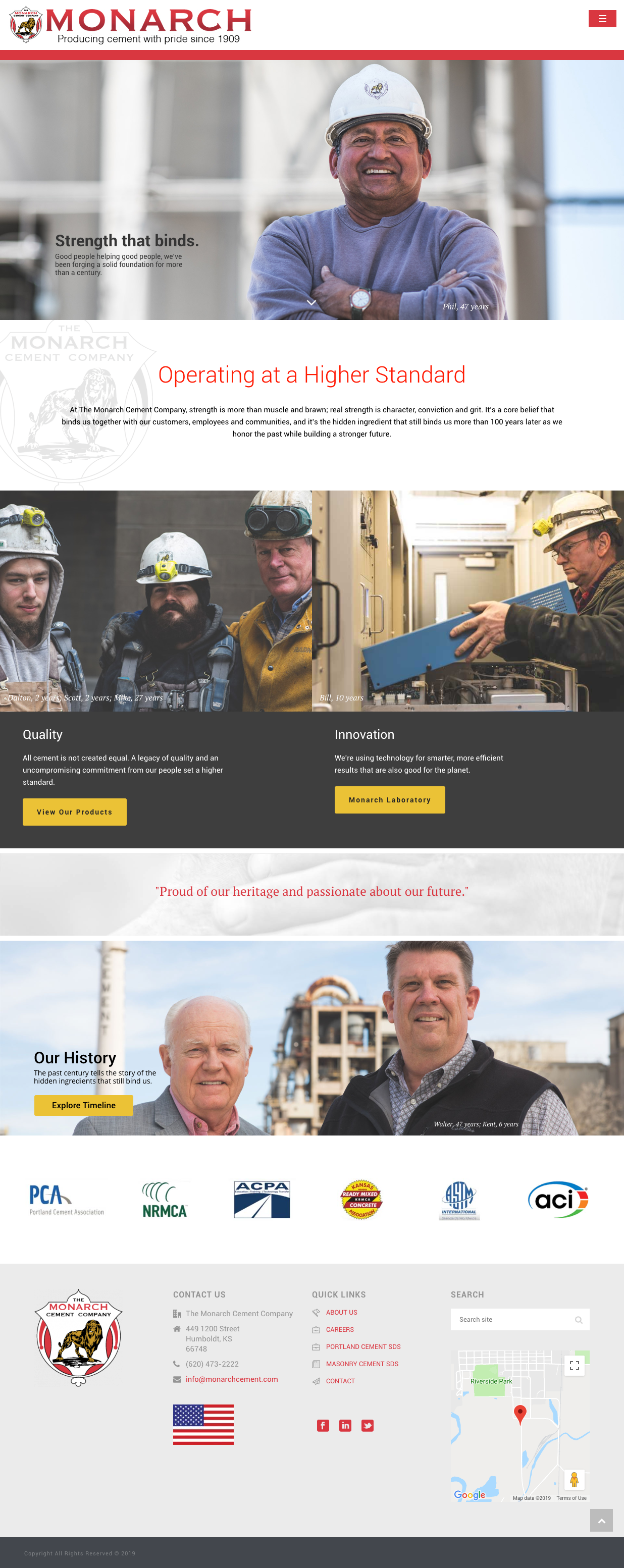
All of Monarch’s competitors use wide shots of their facilities and employees on their site, but we wanted to show that the people are what make Monarch the company that it is. In order to achieve this, we made images the focus in the homepage design. We hired a photographer to capture shots of employees as they are - gritty and authentic. Our photo treatment pulls out a lot of the saturation to pay heed to Monarch’s legacy as a 100+ year company. We paired this with a more blocky layout to modernize Monarch’s site.
Red accents are used throughout the site to bring in the red from their brand and logo.


Interior page designs:
I built the homepage and two interior page templates in Adobe XD. The first interior page (one level below the homepage) was designed for images to be prominent like the homepage, with easy and clear navigation for a user to go deeper into a particular topic or service line. Many of the users are older, so clarity and contrast were key in handling information on these pages.
The second interior page template was designed to display the most written content of all the site’s pages. The design allows for the copy to read like an article, and spaces for images to be placed throughout.